




Data Insights
Visualize and troubleshoot your end-to-end Cribl Stream data flows.
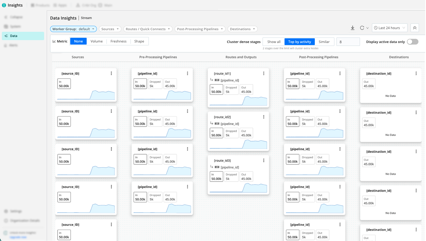
Data Insights provides an interactive topology view of your Cribl Stream data flows, showing how data moves from Sources through Pre-Processing Pipelines, Routes/QuickConnect, and Post-Processing Pipelines to Destinations, with metrics for volume, freshness, and shape. On eligible Source and Destination cards, a persistent queue (PQ) sidecar is displayed. It is designed for quick troubleshooting and validation of end-to-end flows across Worker Groups and time ranges.
Benefits of Data Insights
Data Insights gives you the ability to quickly locate issues in your deployments, confirm how deployment changes will impact metrics, and see where data volume changes happen. The map is configurable, so you can cluster important paths and collapse the rest.
Spot partial failures, bottlenecks, drops, and misconfigurations by visualizing how Sources, Pipelines, and Destinations connect. Use the map to see when a Source is not attached to the expected Route, identify stale or inactive Sources, and trace events/bytes and freshness along the flow path.
Compare metrics across time windows to confirm the impact of configuration or deployment changes.
See where volume changes (reduction/enrichment) occur and where the Shape metric (field count per event) grows or shrinks across map cards. Use this to spot Sources with excessive fields, Pipelines/Packs that expand or reduce fields, and unexpected field-count variance that might indicate data-quality issues.
When a stage has many map cards, use clustering to keep the busiest paths visible, collapse the rest into summary cards, and expand or pin specific cards when you need detail.
How It Works
The main structure of Data Insights is the topology map. Within the topology map, you’ll find map cards representing Sources, Pipelines, Routes/QuickConnect, and Destinations. Select a map card to open its details pane with time-series views.
The following columns are displayed (left-to-right):
- Source: Ingest points producing Events, Bytes In and Freshness In, and (when enabled) Shape, which reflects the number of fields per event.
- Pre-Processing Pipeline: The first processing stage, where you typically parse, normalize, and filter data before routing. Expect changes in volume and Shape here as fields are extracted or dropped.
- Routes / QuickConnect: Data routing/branching layer that directs events to Pipelines and Destinations. Use this column to verify that Sources connect to the expected paths.
- Post-Processing Pipeline: Where transformations, enrichment, and reduction occur. You can expect divergence between Events and Bytes In vs. Out, and Shape changes as Pipelines or Packs add, modify, or remove fields.
- Destination: Egress targets showing Events, Bytes Out, and related Freshness at the boundary.
- Details Pane: Select a metric map card to open the details pane with time-series views for events, bytes, and freshness, aligned to your time range and filters. When a card has a persistent queue sidecar, you can select it to open a dedicated PQ view. Select a cluster card (a grouped summary for many map cards in one stage) to open the cluster drawer instead of metric charts.
When Shape metrics are enabled, map cards can also show the minimum and maximum number of fields per event over the selected time range. This helps you see how schema complexity changes through the flow, identify Sources with excessive fields, and find Pipelines/Packs that expand or reduce fields unexpectedly.
Select the action menu (upper-right of the map card) to configure the object the map card represents, filter the view to it, or copy its IDs.
Cluster Dense Stages
When a single stage (Source, Pipeline, Route, and so on) contains more map cards than you can easily read, Data Insights replaces the overflow with cluster cards. These summarize the number of grouped cards, preview stage badges, and roll up the active metric (like volume) for the hidden set.
To change how and when clusters appear, use the Cluster dense stages controls in the Map Settings.
Managing Clusters:
Hover over a cluster card for a quick detail popover. Select the card to open the details drawer in cluster mode, where you can view summary counts, search for grouped cards, or sort by Rank or Name.
- Pinning: Select Pin on any listed map card to keep it permanently visible, even when its stage is clustered. Pinned cards display a pin control you can select to remove the pin. Data Insights stores your pins locally; they clear only when you change the Worker Group.
- Expanding and Collapsing: Select Show all in the drawer to expand a cluster into individual cards on the map. Select Regroup expanded clusters in the top bar to collapse all expanded clusters at once.
Filters still apply to clusters. Cluster summaries reflect only the grouped map cards remaining on your filtered path. Very small filtered clusters may expand automatically so single-card clusters do not hide information.
Persistent Queues
A PQ sidecar appears on Source and Destination cards when:
- Sources: Persistent queue is enabled and the Source has a configured Queue size limit.
- Destinations: Backpressure behavior is set to Persistent Queue and has a configured Queue size limit.
PQ utilization is calculated from:
- Used (bytes): The persistent queue size (
pq.queue_size), summed across all Workers in the Worker Group at each reporting interval, then aggregated as the peak queue usage per time bucket in charts. - Limit (bytes): The Queue size limit configured for the Source or Destination PQ. For Destinations, reported totals multiply this per-Worker limit by Worker count so the limit line matches aggregated usage.
- Utilization: Persistent queue usage (%), the ratio of peak queue usage to Queue size limit, from 0% to 100%.
For background on enabling and tuning queues, see About Persistent Queues.
Caveats
- Source and Destination volumes differ: Bytes In (Source) and Bytes Out (Destination) don’t match because Data Insights accounts for compression, formatting, and protocol overhead at the Destination. Both values are correct relative to their specific measurement points.
- Aggregation Functions affect Source filtering: When you filter the map by Source, the Destination still displays the full aggregated volume if an Aggregation Function is used in the Pipeline. If a Function combines events and removes attribution fields, it prevents Data Insights from isolating that specific Source’s contribution.
- Shared Pipelines and QuickConnect: If a Pipeline or QuickConnect is used by multiple Sources or Destinations, it appears as a distinct map card for each connection. This ensures that metrics remain specific to the traffic of that particular path, rather than being aggregated across all connections sharing that name.
- PQ sidecar vs. flow metrics: The map’s main card metrics (volume, freshness, shape) follow the map time range and settings. The PQ drawer can use its own time window for the utilization chart - refresh PQ data independently when you need a narrower or wider window than the map.
- Clusters and filters: After Cluster dense stages groups the topology for your Worker Group and topology mode, filters and metric-value filters still affect which cards you see. Cluster counts and metrics are adjusted so that they describe only map cards that remain on the visible path.
Map Settings
Use these controls (top bar and sidebar) to refine what you see.
Refresh: Refreshes the map and the details pane metrics using the current time range and filters.
Worker Group: The map is limited to a specific Worker Group to focus on a subset of infrastructure. Changing the Worker Group updates the map cards and metrics displayed.
Time period: Select a time range (for example, last 15 minutes, 1 hour, 1 day). The map and details pane re-render using aggregated resolution appropriate to the range.
- Use Compare to see how the current time range’s metrics differ from the same-length window at an earlier point in time. This is helpful to validate recent changes, confirm regressions, or distinguish new issues from normal historical patterns. Select a Comparison period to see the current metric value on each map card, with a percentage change versus the comparison period. Both periods are plotted on the same charts so you can quickly see increases, decreases, or pattern changes. The Comparison period controls how far back the earlier window starts.
Filter: Focus the map to specific components. You can filter by: Source, Routes/QuickConnect, Destination, Current Alert Status, and Metric Value (when a Metric type is selected).
- When you select a Source, Route/QuickConnect, or Destination, the map highlights that card and renders its directly connected cards to preserve context, rather than hiding all other cards that do not strictly match the filter.
- When you filter by Current Alert Status, the map shows only the Sources and Destinations whose active alert matches the selected status, along with their directly connected cards for context. See Alerts on the Data Map.
- If you select multiple cards, the map shows the union of their focused subgraphs (everything connected to any selected card), not the intersection. This avoids empty or misleading graphs when selected cards are not connected to each other, while still narrowing the view to the most relevant parts of your topology.
Cluster dense stages: Control how Data Insights groups dense stages to keep the map readable. A status line beneath the controls summarizes the current topology’s outcome (for example, how many stages exceed the limit). Many clustering and map options are reflected in the page URL for sharing and bookmarks.
- Show all: Render every map card without clustering. Selecting this opts the current Worker Group out of automatic clustering until you explicitly select Top by activity or Similar.
- Top by activity: Keep the highest-activity cards visible based on your chosen metric. Once a stage exceeds your Max cards per stage limit (default 8, minimum 2), the remaining cards collapse into one cluster card per stage. Inactive cards rank below active ones, and ties maintain the graph’s stable order. On first load, if any stage has more than eight map cards and clustering is still at defaults, this mode might turn on automatically.
- Similar: Group map cards in the same stage that share a specific attribute. Use Attribute grouping to cluster by Type, Pack, Route, or Destination.
Metric Controls
Below the filters, use the metric controls to choose what each map card and sparkline shows.
- Metric: Select the type of metric to display on map cards:
- None: Hide per-card metric values. Show only topology.
- Volume: Show volume metrics. For example, events and bytes in and out.
- Freshness: Show data freshness metrics (age of events) instead of volume.
- Shape: Show schema metrics based on field count. For example, minimum and maximum number of fields per event. Use this to spot Sources with excessive fields and Pipelines or Packs that unexpectedly expand or reduce the number of fields.
- Metric Display: Choose which values to show for metrics that have In/Out pairs (Volume and Freshness):
- Max In/Max Out: Display the maximum value seen at input and output over the selected time range.
- For Volume, this highlights peak events/bytes.
- For Freshness, this highlights the stalest data.
- Min In/Min Out: Display the minimum value seen at input and output.
- For Volume, this shows the lowest observed rates.
- For Freshness, this shows the freshest (lowest-latency) data.
- Max In/Max Out: Display the maximum value seen at input and output over the selected time range.
- Sparkline: Choose which metric the small per-card sparkline represents. For example, Max Freshness In/Out or Min Freshness In/Out. This helps you see freshness trends at a glance without opening the details pane.
- Display active data only: When toggled on, hides cards and connections with no activity in the selected time range. Use this to declutter the map and focus on components that actually processed data.
Details Pane (Card Drilldown)
Select a metric map card to open a right-hand details pane with the tabs below. Cluster cards open the drawer in cluster mode instead. For lists, search, and Pin behavior, see Cluster dense stages.
- The details pane respects your Worker Group, time period, and filter selections.
- Freshness charts expose min/max variants (for example, min in, max out) that correspond to where the metric is measured in the flow.
PQ sidecar pill: Select the sidecar pill on eligible Sources and Destinations for a persistent queue view instead of the Events/Bytes/Freshness/Shape tabs. This includes a capacity summary (utilization % and used/max bytes as described under persistent queues), a PQ utilization time series (0-100% over the selected window for that chart), and an independent time window setting.
Events: Time-series of events metrics for the selected component. For example, Events In/Out, totals, and maximum values appropriate to the overlay and component. Use this to verify symmetry and detect gaps or spikes.
Bytes: Time-series of bytes metrics (Bytes In/Out) for bandwidth and reduction checks. Use this to confirm compression/reduction effects and identify downstream throttling symptoms.
Freshness: Time-series of minimum and maximum freshness (age) of events across the time range. Use this to detect stale or delayed data and align freshness anomalies with component behavior. Shape: Time-series of minimum and maximum field counts per event. Use this to see where schemas expand or contract, identify Sources with excessive fields, and spot unexpected field-count changes that might indicate data-quality or parsing issues.
Alerts: For a selected Source or Destination, the details pane includes an Alerts tab alongside the metric tabs. The tab badge indicates the number of alerts for the entity, and the tab has its own time-range selector so you can widen or narrow the alert window independently of the map. The Alerts tab includes:
- Alert history chart: A time series showing the count of alerts for the entity over the selected window. When the history exceeds the display limit, a banner appears with a View All link that opens the Active Alerts page for the full history.
- Alerts table: A list of alerts for the entity within the selected window:
Field Description Alert The name of the Monitor that generated the alert (for example, pq_health).State The alert severity, matching the Active Alerts page: Critical,Warning, orInfo.Start Time When the alert started, shown as an absolute timestamp and a relative time (for example, 12m ago). Select the column header to sort.Actions Select View to open the Active Alerts page filtered to that alert.
For how alerts appear on the map itself, see Alerts on the Data Map.
Use the top-right controls to filter the map to the selected object (filter icon) or copy its identifier (copy icon). In the bottom bar, select Configure to open the object’s configuration.
Alerts on the Data Map
Data Insights surfaces alerts on the map so you can see problems in the context of your data flow. The map reads from the same alerts that Monitors generate and that you triage on the Active Alerts page; it does not define new alert conditions. Source and Destination cards indicate when an entity has an alert within the selected time period.
- Active alerts: A card indicates when its Source or Destination currently has an active alert.
- Historical alerts: A card indicates when its Source or Destination experienced an alert at any point within the selected time period, even if that alert has since resolved.
Severity and sparkline overlays: Alerts appear on the card’s default sparkline. When alerts overlap in time, the card shows the highest severity on top, so a Critical alert hides a Warning behind it. Severity levels match the Active Alerts page: Critical, Warning, and Info.
To focus the map on cards with a specific alert state, use the Current Alert Status filter in the Map Settings. To inspect an entity’s health stats, historical alerts, and active alerts, open its details pane.
Workflows
Detect partial failures: Set Metric to Volume, filter to a specific Route or Destination, and scan for divergence between In and Out across map cards. Drill into cards with anomalies and review the details pane to localize the interruption.
Validate transformations: With Metric set to Volume, compare In vs. Out across Post-Processing Pipelines to confirm expected reduction or enrichment. Then pivot to the Events, Bytes, or Freshness tabs in the details pane to make sure behavior is stable under load and time.
Investigate staleness: Set Metric to Freshness, use Metric Display and Sparkline to focus on Max or Min In/Out, and drill into upstream components with high maximum freshness to identify where delays enter the flow.
Review persistent queue headroom: Scan Source and Destination cards for the PQ sidecar. Select the pill to open PQ mode in the details pane, set the PQ chart time window as needed, and compare utilization peaks to your configured limits.
Use clustering on a busy Worker Group: Leave Metric on Volume (or another family you care about), open Cluster dense stages, and use Top by activity with a Max cards per stage that matches how many cards you can scan per column. Open a cluster card, sort by Rank, and Pin the map cards you are actively debugging so they stay visible when you regroup the rest.
Investigate alerts in context: Set the time period to the window you are investigating, then use the Current Alert Status filter to isolate the Sources and Destinations with active alerts. Select an affected card to open the details pane, review its health stats and historical alerts, and select an active alert to open the Active Alerts page for full triage.