


Donut Chart
Visualize your search results, using a Donut Chart.
Donut Charts summarize how a total amount is divided into numerical proportions. Use a Donut Chart when you want to compare parts of a whole against the whole and its other parts, such as the distribution of operating system usage.
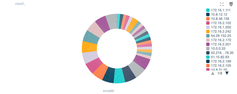
Chart Settings
Color palette: Select the color scheme you want to use in your Chart.
Data Settings
Show only top N values: An optional numerical value that sets the Chart to display only the larger values of a Dataset, with smaller values filtered out. To display the smaller values grouped into a single category, enable Summarize other values.
Legend Settings
Position: Where to display the legend relative to the chart.
Truncate: By default, Cribl Search truncates labels to fit your browser viewport, substituting a ... for omitted characters. Toggle this off if you prefer to not alter labels.