


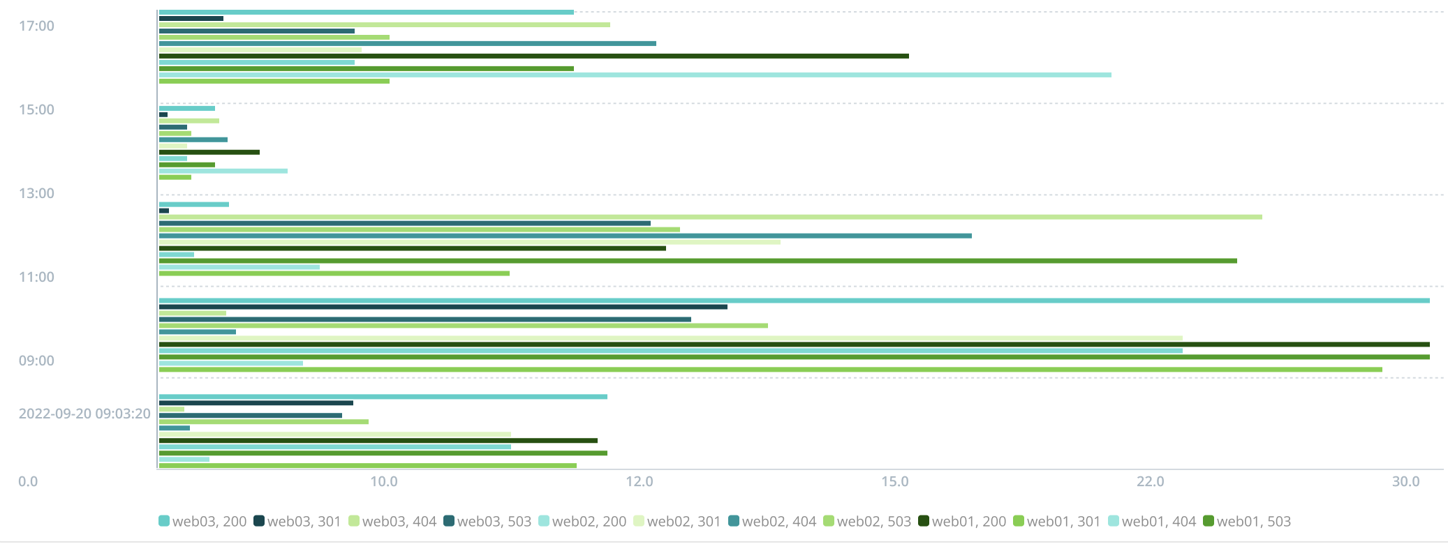
Horizontal Bar Chart
Visualize your search results, using a Horizontal Bar Chart.
A Horizontal Bar Chart is best used to render categorical results (such as “Top X Values”) or to render a large numbers of results.
If you prefer a bar Chart with vertical orientation, select the Column Chart type.
Chart Settings
Color palette: Select the color scheme you want to use in your Chart.
Save chart settings: Whether or not to persist Chart customizations when running new queries. For details, see Saving or Resetting Customizations.
Data Settings
Interpolation: Select Connect null values to display null values. The default Leave gaps option hides null values.
Stack series: When enabled, data in the same category are stacked together. (This option is only configurable for Bar and Area Charts.)
Series table: You can edit the name of a series in the Series name column. The Type column allows you to set a different Chart type for each series. Use the Color column to set the desired color for the series.
The Trellis view option is not displayed, and the Stack series option is not selectable, on this Chart type.
X-Axis Settings
X-axis field: The data field to use for the X axis of the Chart. Defaults to a field chosen automatically based on the selected search.
Title: The label shown on the x-axis. Defaults to the field name that the axis references. Enter a custom name if needed.
Label orientation: The angle of rotation to display additional labels. Defaults to 0°.
Position: Where to display the axis labels on the Chart.
Y-Axis Settings
Y-axis fields: The data fields to use for the Y axis of the chart. Defaults to fields chosen automatically based on the selected search.
Title: Defaults to the field name the axis references. Enter a custom name if needed.
Position: Where to display the axis labels on the chart. Defaults to Left.
Scale: Sets the distance between results. The default Linear scale uses an equal rate of change. A Logarithmic scale uses a percentage change.
Interval: The size of the axis measurement unit. For example, each interval on the y-axis can represent 2 or even 10 units, while each interval on the x-axis represents 1 unit.
Min: The minimum limit of units to display.
Max: The maximum limit of units to display. Defaults to dataMax where the maximum unit of data is used.
Show gridlines: Disable to hide the horizontal lines on the chart.
Legend Settings
Position: Where to display the legend relative to the chart.
Truncate: By default, Cribl Search truncates labels to fit your browser viewport, substituting a ... for omitted characters. Toggle this off if you prefer to not alter labels.